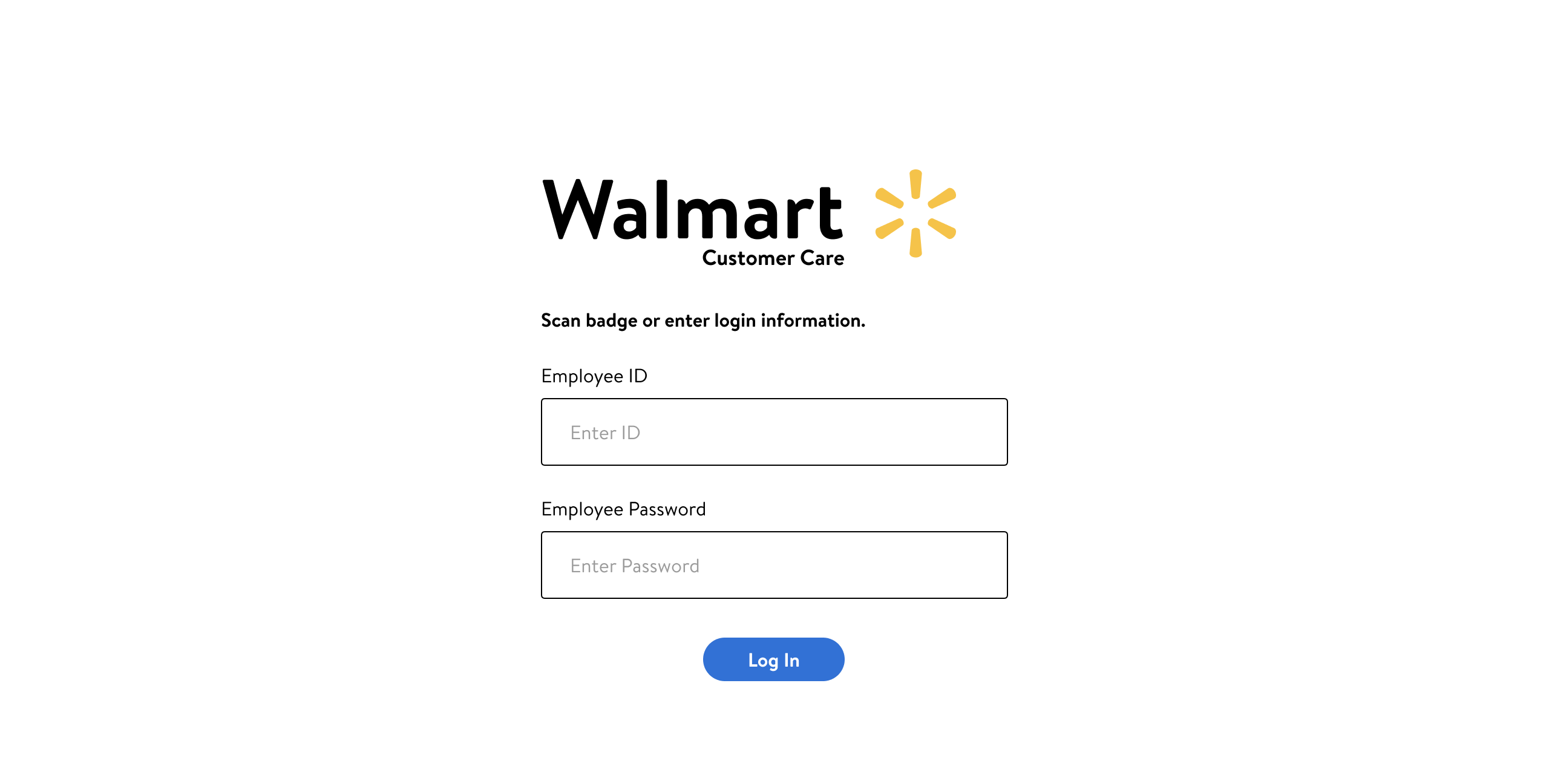
Walmart associate's screen displaying login fields for Employee ID and Employee Password.
Hi-fidelity mockup of the employee login screen.
Walmart Customer Care Project Logo

Designing an intuitive interface that empowers and supports Walmart customer care associates.

why this project?

Walmart is a multinational retail corporation known for their wide range of affordable products. As one of the world's largest retailers, Walmart experiences some of the highest rates of customer service requests in the industry. After speaking with the Walmart team about their experience with their current customer care system, we felt that there was opportunity for improvements that would positively impact the day-to-day work experience for their employees.


Team
  • Andrew B.
  • Bahar T.
  • Francesca C.
  • Jason N.
  • Katie H.
  • Meghan R.
Get to know us!
Project Specifications

Duration: 3 weeks

Scope:

  • Survey design & distribution
  • Ethnographic field research
  • One-on-one user interviews
  • Secondary research
  • Competitive Analysis
  • Wireframing
  • Prototyping
  • Front-end development
Deliverables

UX & UI Design:

  • High-fidelity wireframes and prototypes
  • Design rationale for each hi-fi screen
  • User research plans, data, and synthesis
  • Case study presentation

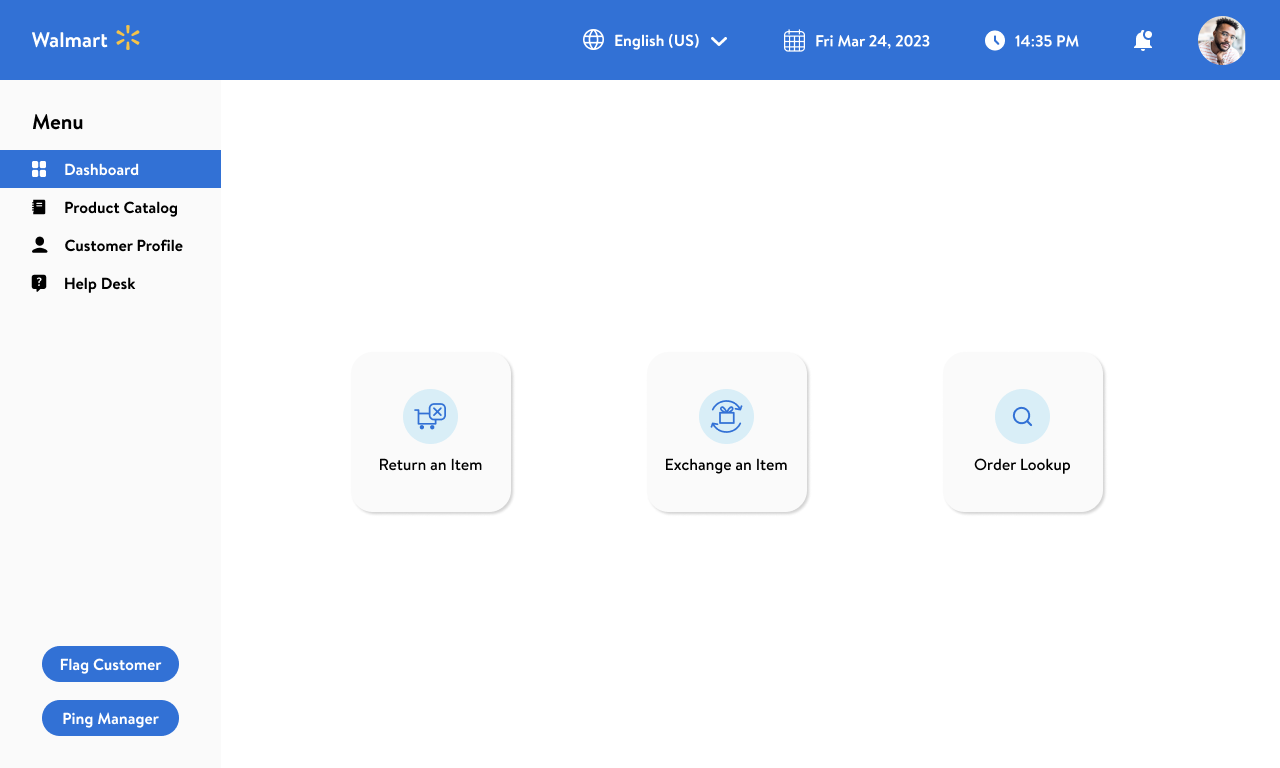
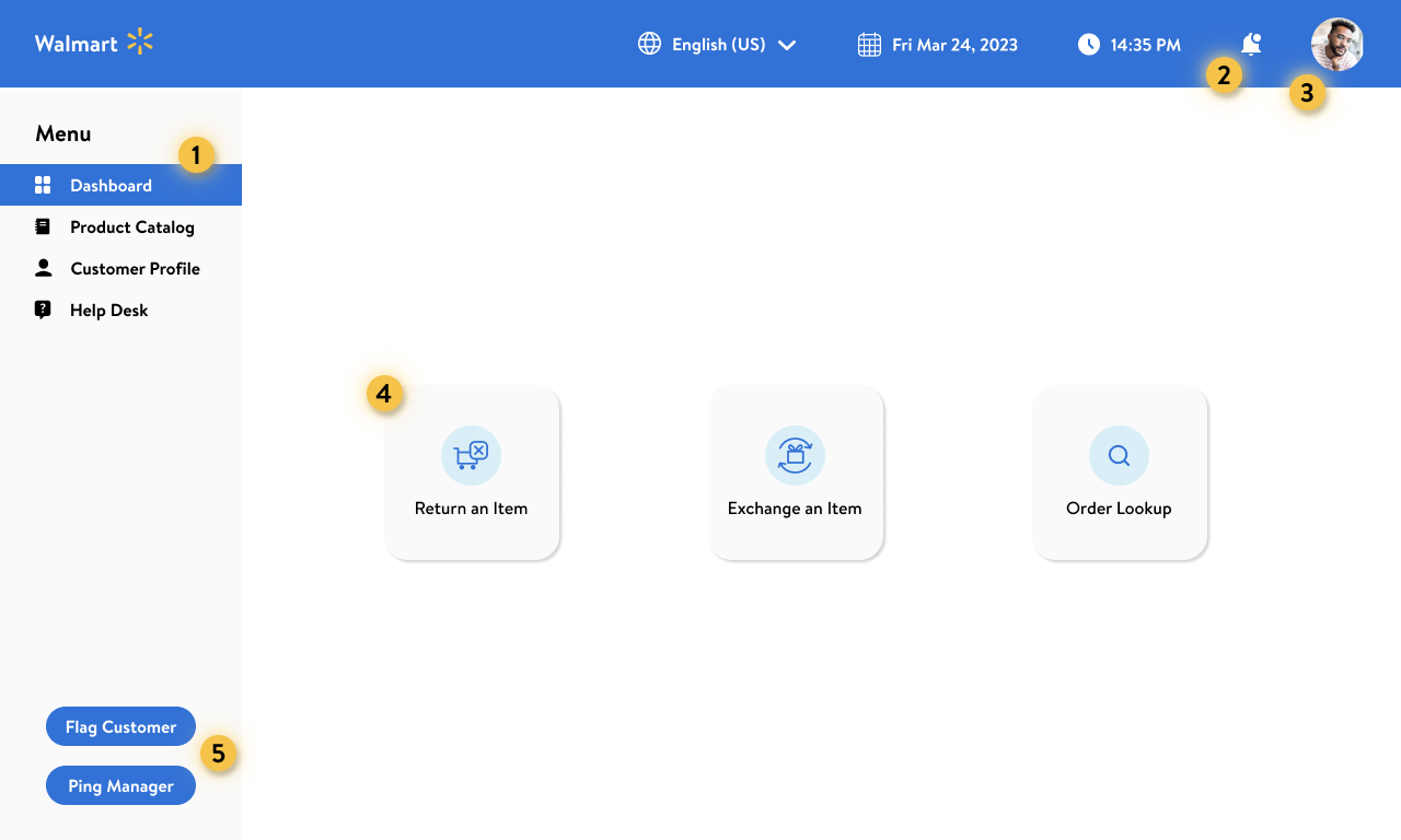
Walmart associate's screen displaying their dashboard with left side bar of main application menu and 3 large buttons for Return an Item, Exchange an Item, and Order Lookup.
High-fidelity mockup of the employee dashboard, once logged in.

Desktop (Touch Interface)

We designed the employee dashboard to be intuitive, accessible through touch screen, and aligned with current Walmart design guidelines. Within this dashboard, associates have access to any actions or information needed to be successful in their roles. Some key features of this redesign include large, accessible action buttons, access to the company-wide knowledge base and product catalog, a customer information database, and the ability to quickly and discreetly flag customers and call managers.
what was the problem?

Though robust, Walmart's customer care system can be slow and inefficient and does not offer features customer care associates need to appropriately solve or flag requests.

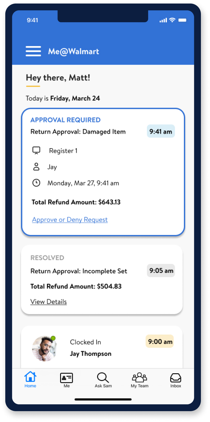
Hi-fidelity mockup of the mobile manager dashboard.

Mobile

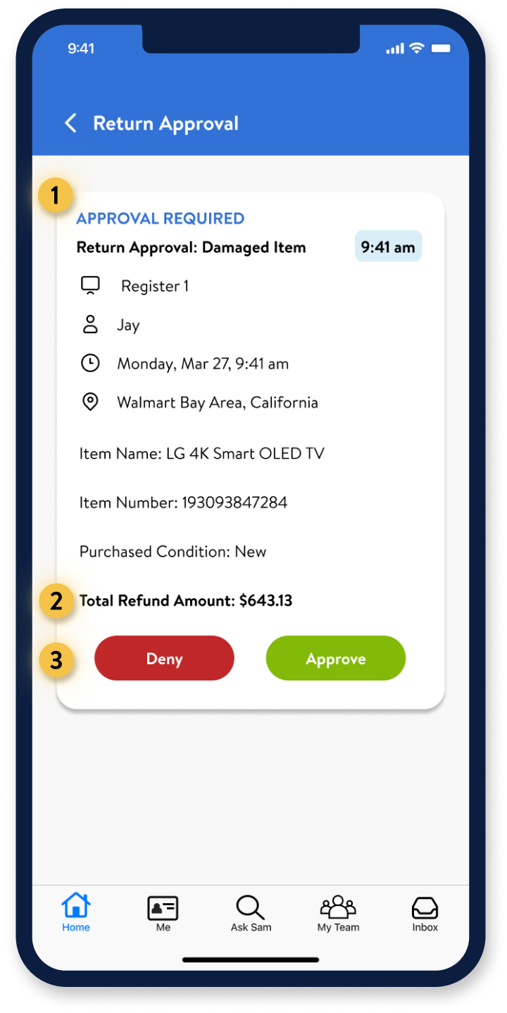
To expedite the return approval process, we designed a series of mobile screens that represent the manager notification part of the user flow. If a return exceeds the $500 limit, all managers, assistant managers, and relevant department heads are notified and can easily approve or deny from their mobile device. This allows managers to quick-approve transactions without visiting the customer service counter unless needed.
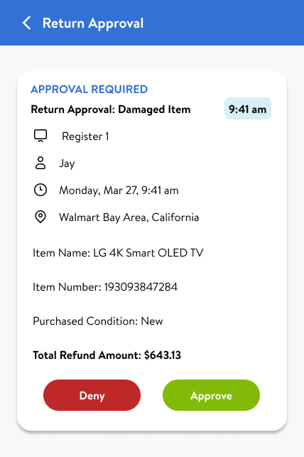
Cropped screen capture of the manager's approval card with employee and query details. Deny and Approve buttons at the bottom.

our proposed solution

We believe an intuitive customer care system will enable customer care associates to quickly validate users and provide effective solutions, resulting in high user satisfaction, customer retention, and an increase in overall financial profit.

Annotated Walmart associate's screen displaying their dashboard with left side bar of main application menu and 3 large buttons for Return an Item, Exchange an Item, and Order Lookup.
High-fidelity mockup of the employee dashboard, once logged in.

Design Rationale: Dashboard

  1. 1Side Navigation This side navigation panel was designed to be accessible through touch screen. Associates can navigate between the dashboard, search for products in the product catalog, see details of customer profiles, and access the company-wide knowledge base through the help desk.
  2. 2Notifications Notifications were added to the toolbar. This is where associates can check their “news feed” for store updates and alerts.
  3. 3Profile Icon The profile icon displays which associated is logged in. This will limit confusion when associates clock out and trade machines with teammates.
  4. 4Hot Key Design These hot keys were designed to be large and easily accessible, as these are some of the most touched keys on the associate screens. We chose dark blue to create contrast and improve overall usability.
  5. 5Frequently Used Buttons These easily accessible buttons were included for associates to flag customers or ping managers. Based on our research, we found that associates wanted a way to quickly flag customers for inappropriate behavior or suspicious activity in an indiscreet way.

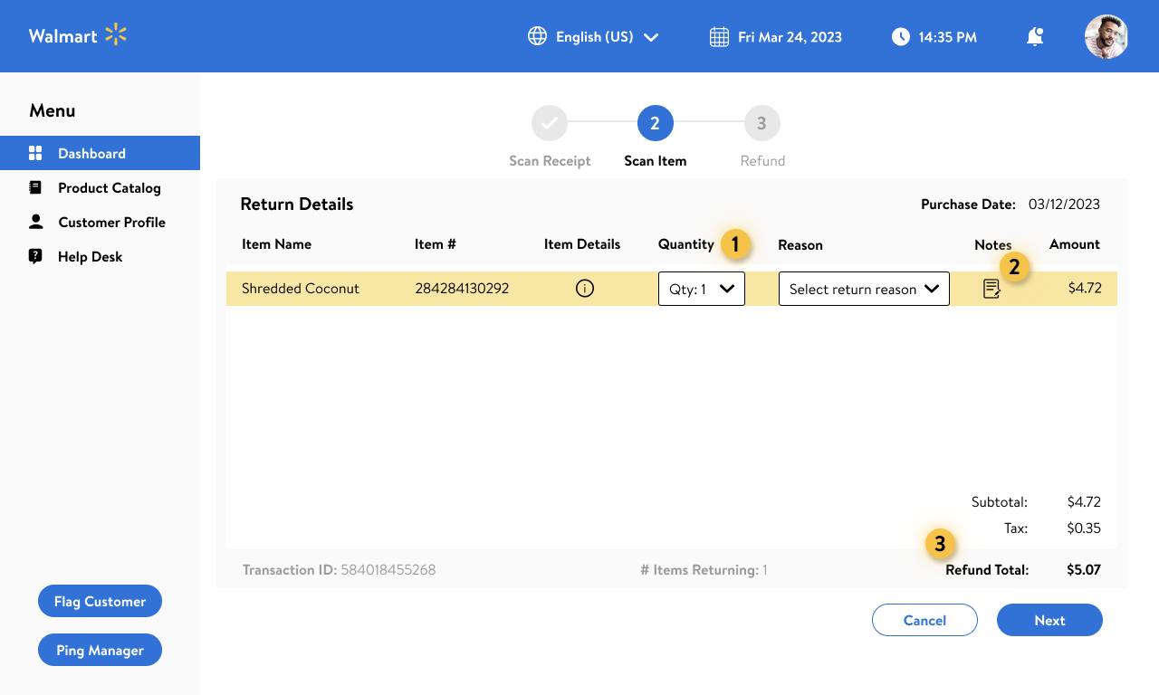
Annotated Walmart associate's screen focused on customer's return details and option to specify quantity and reason for return per item.
Hi-fidelity mockup of the return details page.

Design Rationale: Return Details

  1. 1Adjust Quantity Associates can adjust the quantity if users purchased more than one, and can adjust to zero to remove from the list.
  2. 2Notes Section Through our research, many users said they wanted a place to make notes about a return transaction. When clicked, a modal will pop up with an option to include information. The note will then be saved in the customer profile under this transaction.
  3. 3Scanned Items The total refund amount is indicated at the bottom right corner, based on the items scanned in. This gives associates the opportunity to share how much customers will be getting back through their return.

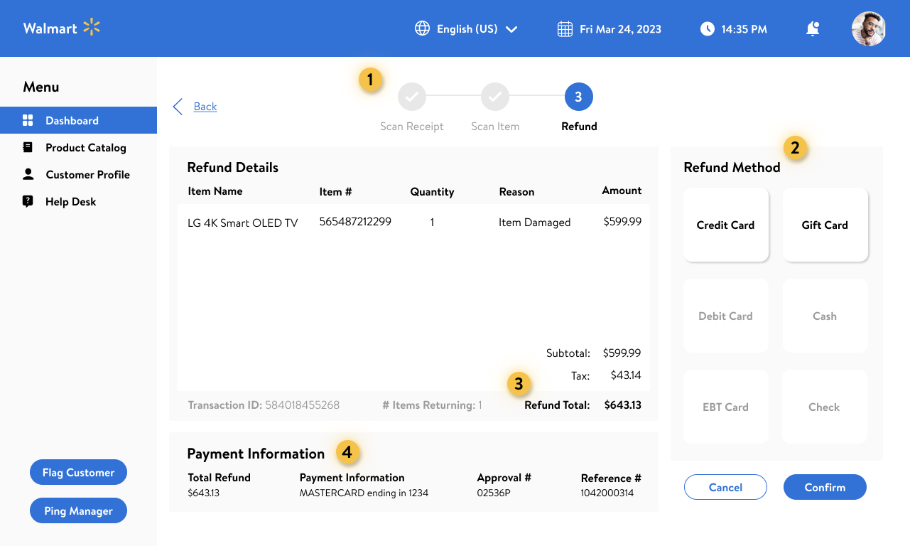
Annotated Walmart associate's screen focused on customer's refund details and options to choose which payment method they want their refund to go to.
Hi-fidelity mockup of the refund details page.

Design Rationale: Refund Details

  1. 1Step-by-Step Process A progress bar on interface shows the user the length of the process and provides reminders of needed actions.
  2. 2Payment Options The options available for payment refund are determined by how the customer originally paid. The methods that are unavailable in a specific transaction will be inactive buttons to limit user error and confusion. The methods listed here align with Walmart's current offerings.
  3. 3Total Refund Amount Total refund amount is restated on this screen so associates can communicate the refund amount to customers.
  4. 4Payment Information The customer's payment information will populate here so associates can ask if they'd like it back through the same payment method or card on file. This information also dictates what refund options appear in the box at right

Annotated Walmart Manager's mobile screen of app displaying the approval in progress card with all relevant order details and buttons for deny and approve.
Hi-fidelity mockup of the mobile manager screen for refund approvals.

Design Rationale: Mobile Approval for Managers

  1. 1Approval Request The reason for return is the first thing managers see when they open a request, followed by the associate name, time, and date for documentation purposes. They can also see the purchase condition of the item and the item name and number, so they can confirm the return eligibility
  2. 2Refund Amount The total refund amount is bolded at the bottom so it's the last thing managers see as they're making their decision.
  3. 3Approve or Deny Approve and deny buttons live at the bottom of the page for easy access. We chose to use Walmart's red and green colors from their design system since they most notably correlated with 'yes' and 'no.' If a manger clicks deny, they will be prompted to visit the customer service counter to explain the decision to the customer.
Walmart Customer Care Project Logo
Sushi Llamas Icon

what's next?

Our next step would be to run another round of usability testing on our high-fidelity prototype and continue to iterate based on feedback.

After a final round of testing, we would refine our pitch presentation and schedule time to meet with stakeholders.

We are excited about the potential opportunity to present our solution to the UX team at Walmart, and are grateful to have collaborated successfully on another project as a team.

Back to Top

Thank you for your time and attention!